Web Design for Aspiring
Tasmanian Businesses
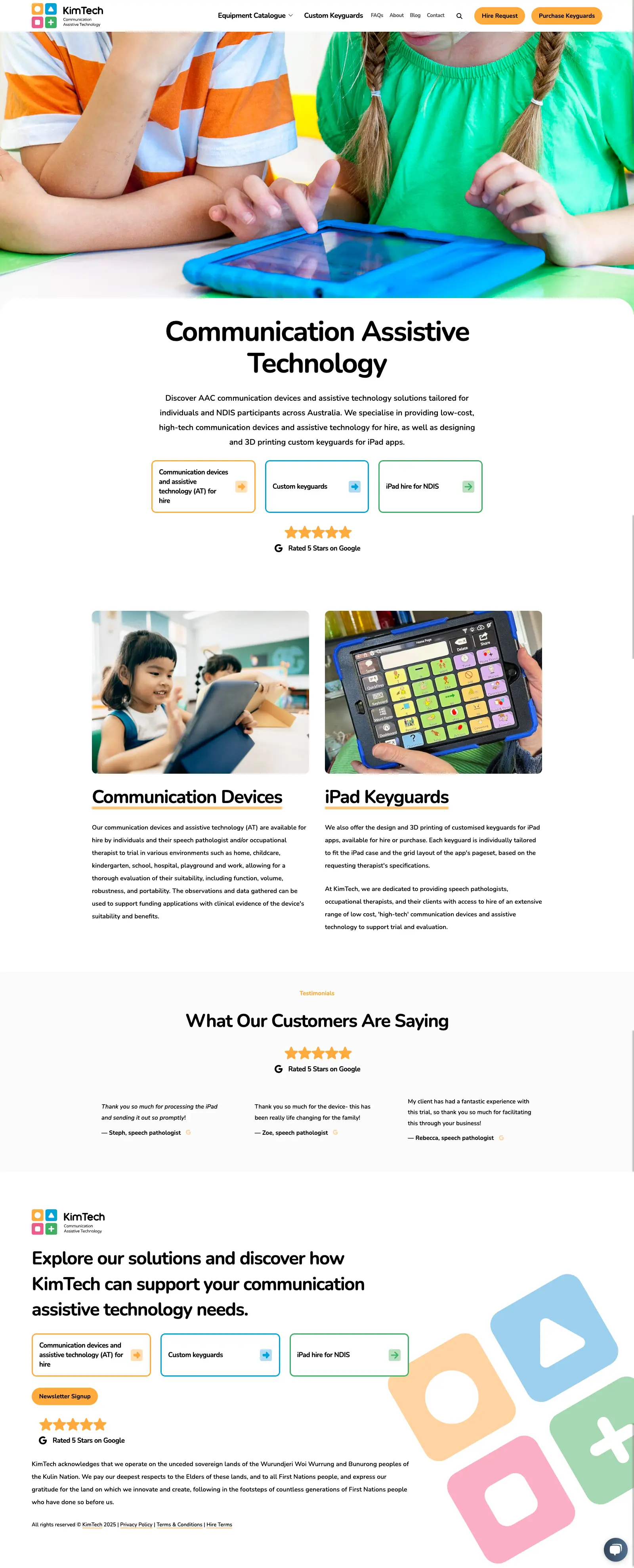
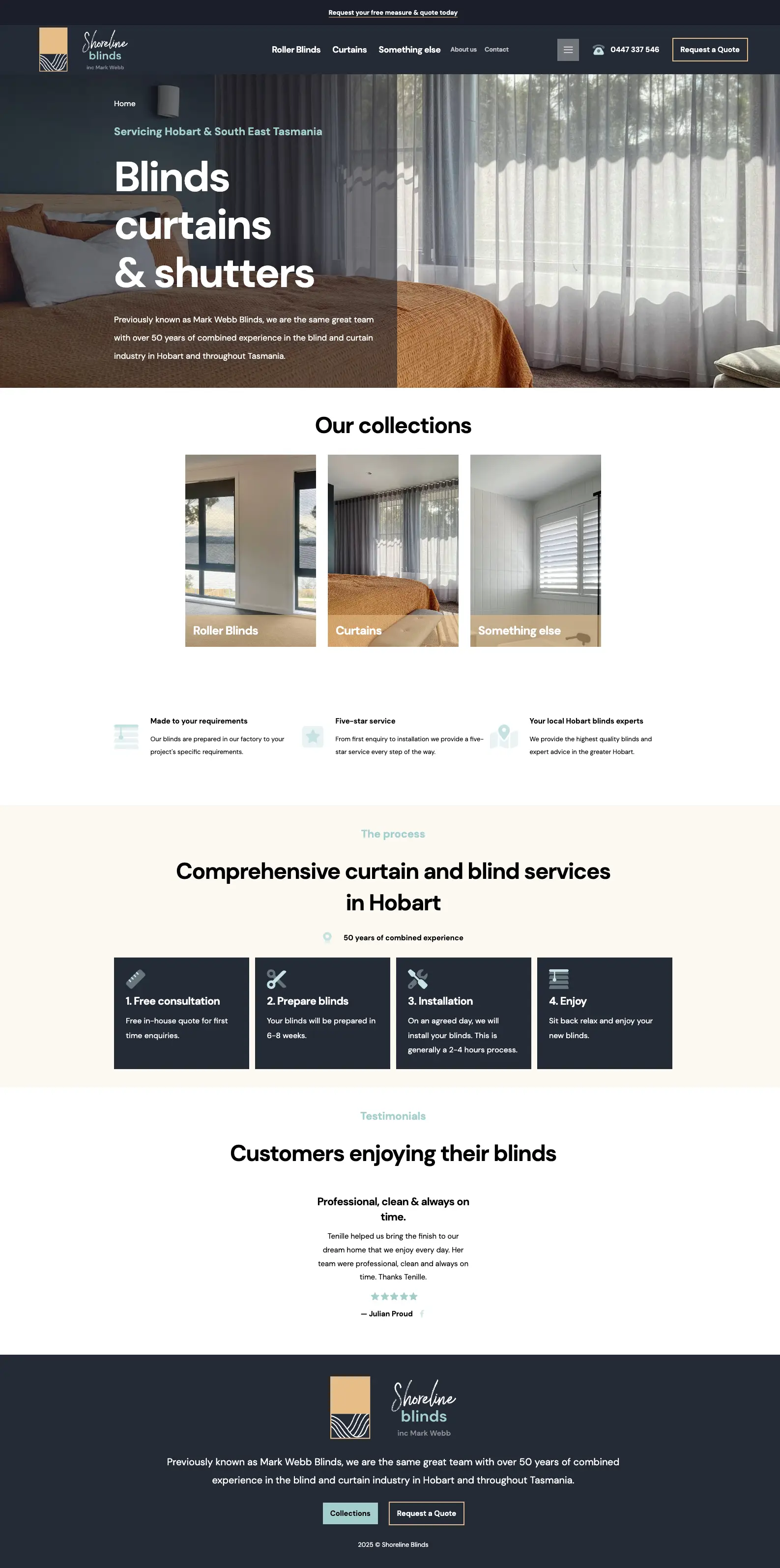
We've been working with aspiring businesses big and small across Tasmania and Australia for well over 10 years, crafting beautiful, engaging websites that capture attention, strengthen brands, and inspire action.
We had a look at the new site, and wow—it's looking amazing! We're loving the design, the colours, and especially the Indigenous-inspired vibe. It really feels like ETMP, and you've done such a great job capturing the direction we were hoping for.
—Enzo, ETMP
Expertise.
We've been helping Tasmanian businesses grow into thriving online brands for over a decade, we understand the unique challenges faced on our small remote corner of the world.
Travel, Tourism & Hospitality
Showcase your unique Tasmanian experiences products.
Agriculture
Make your service and products known to your local and national audiences.
Mechanics & Automotive Services
Highlight your industry expertise and capabilities to you local community.
Trades and Construction
Highlight your industry expertise and capabilities to you local community.
+ Many more...


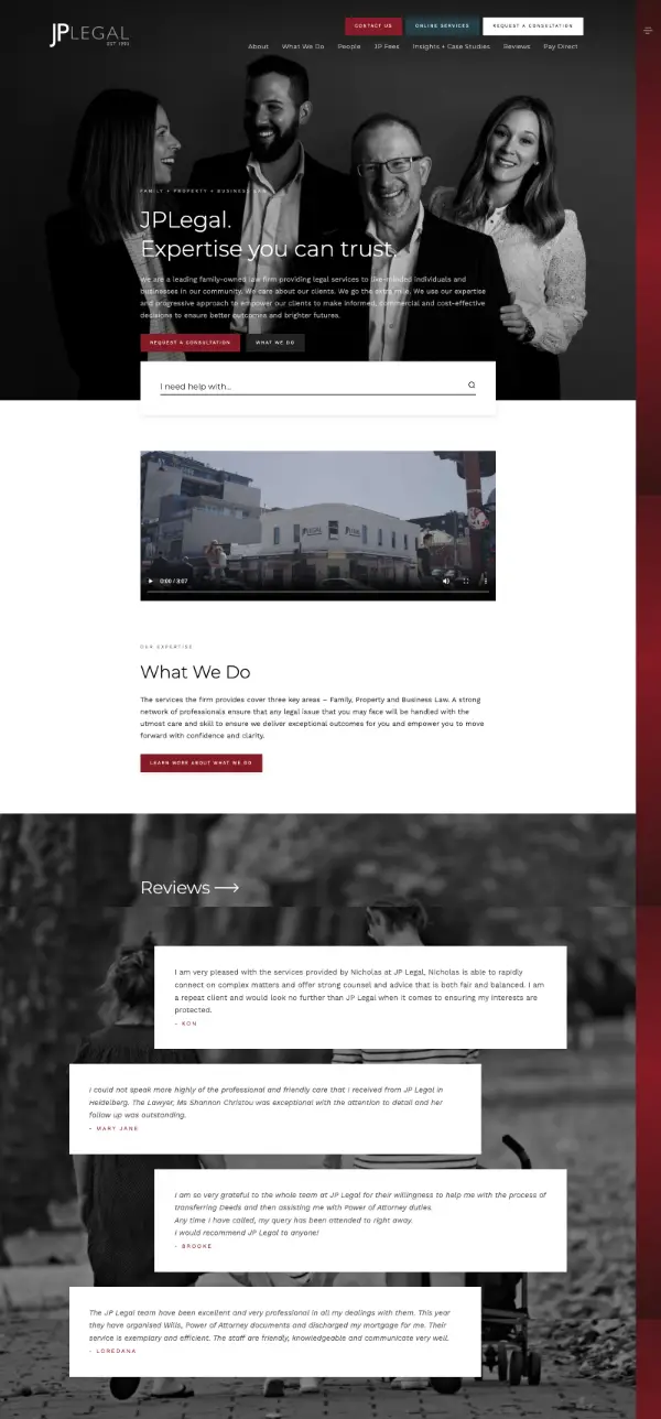


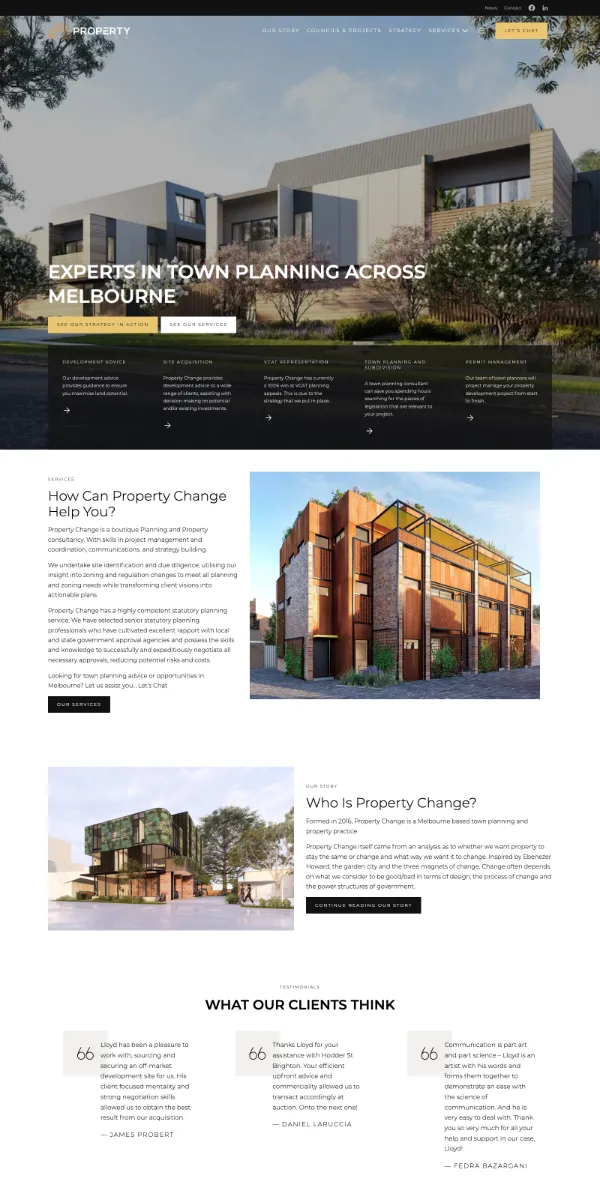
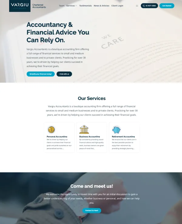

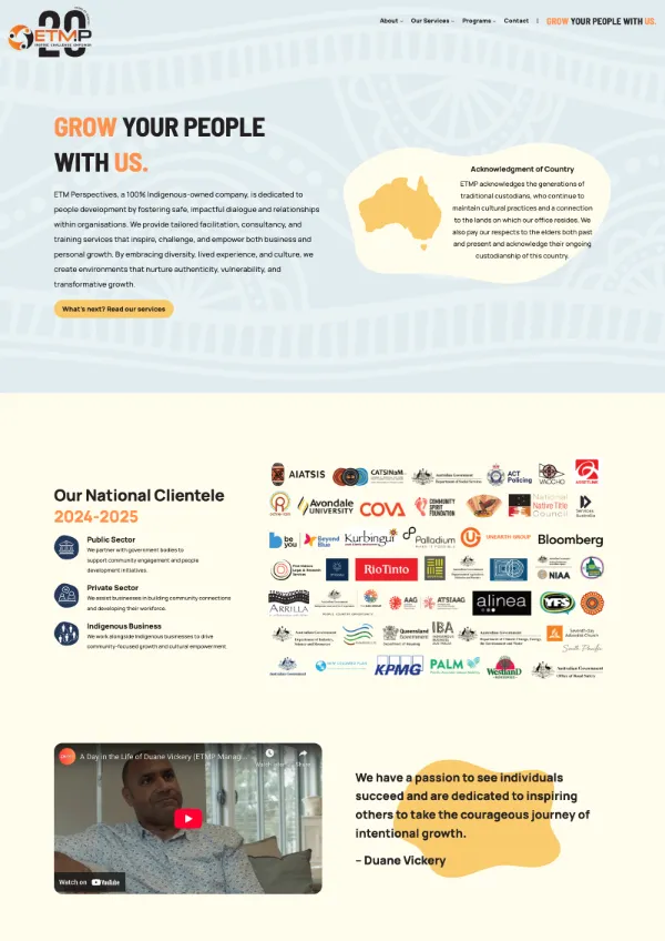
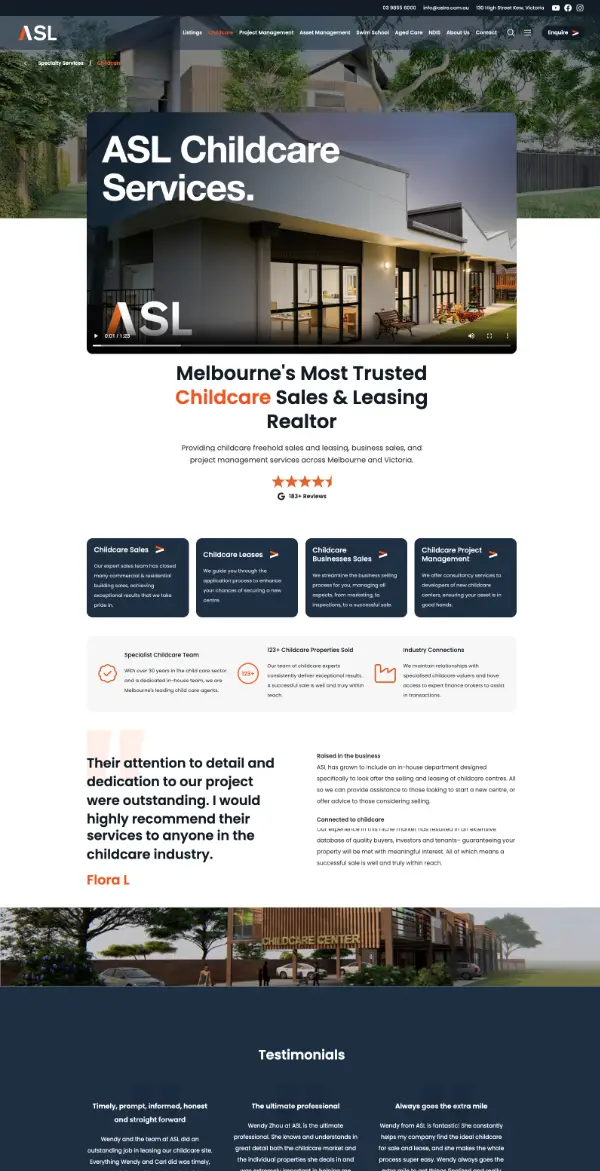


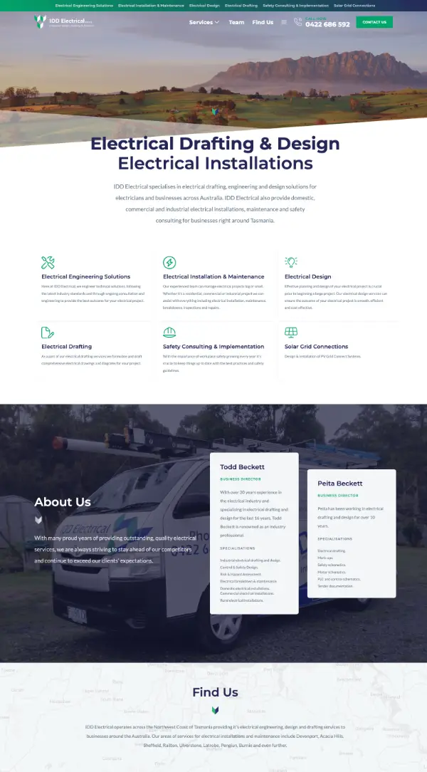

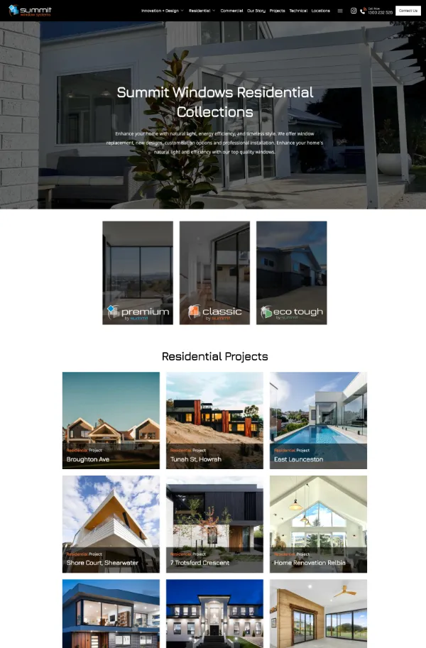
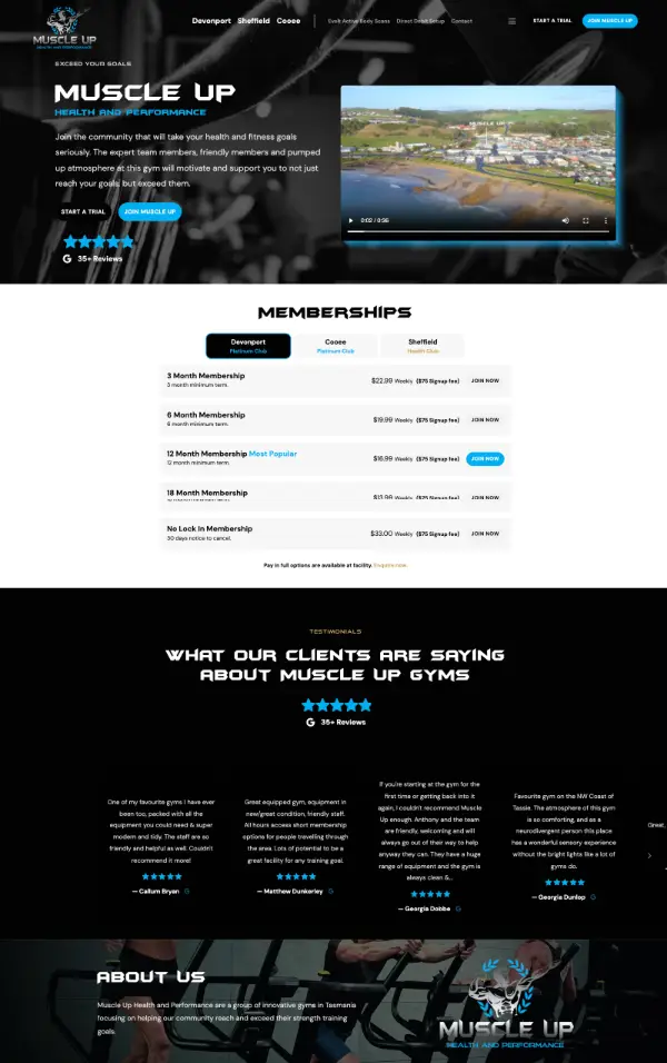


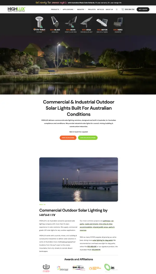
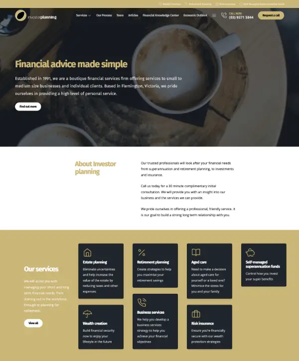
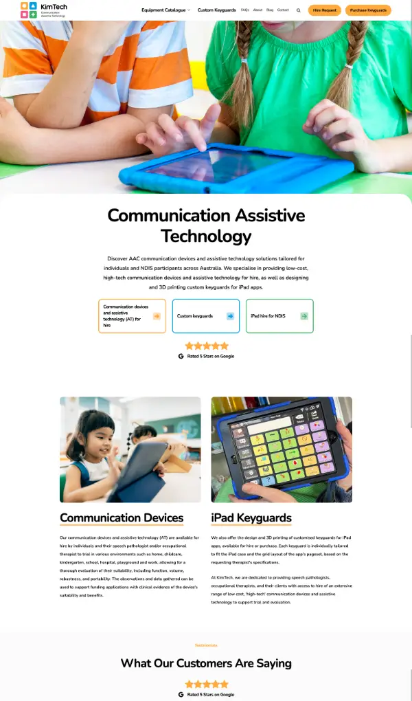
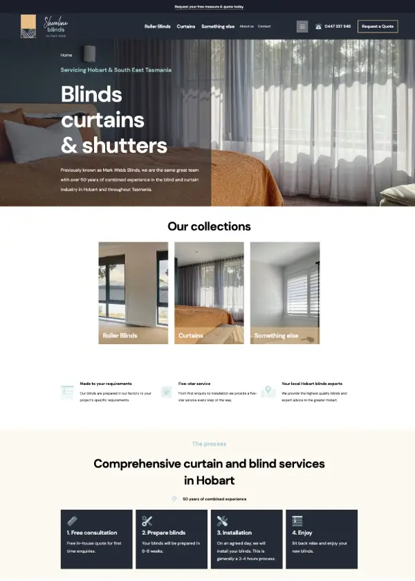


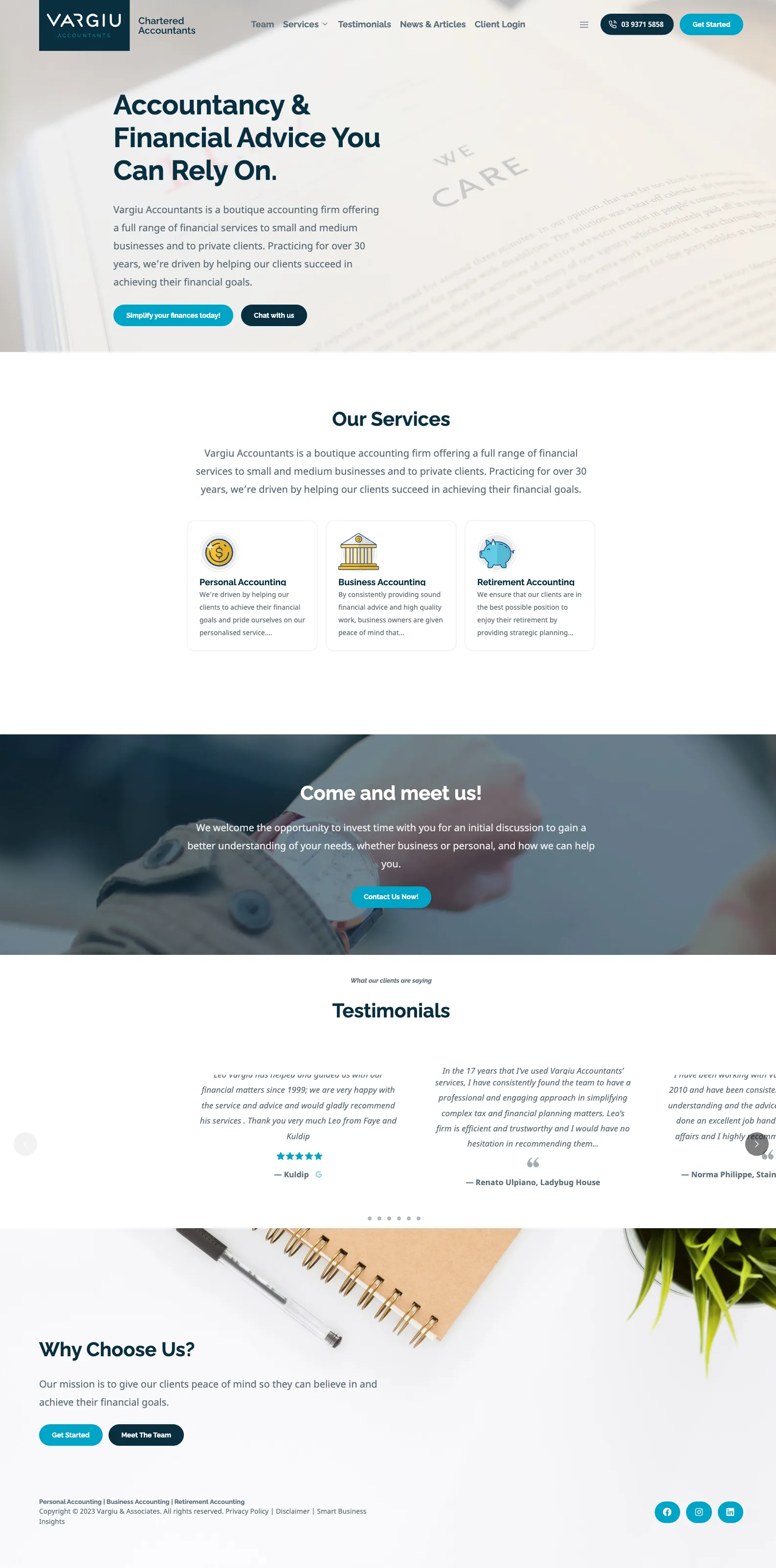
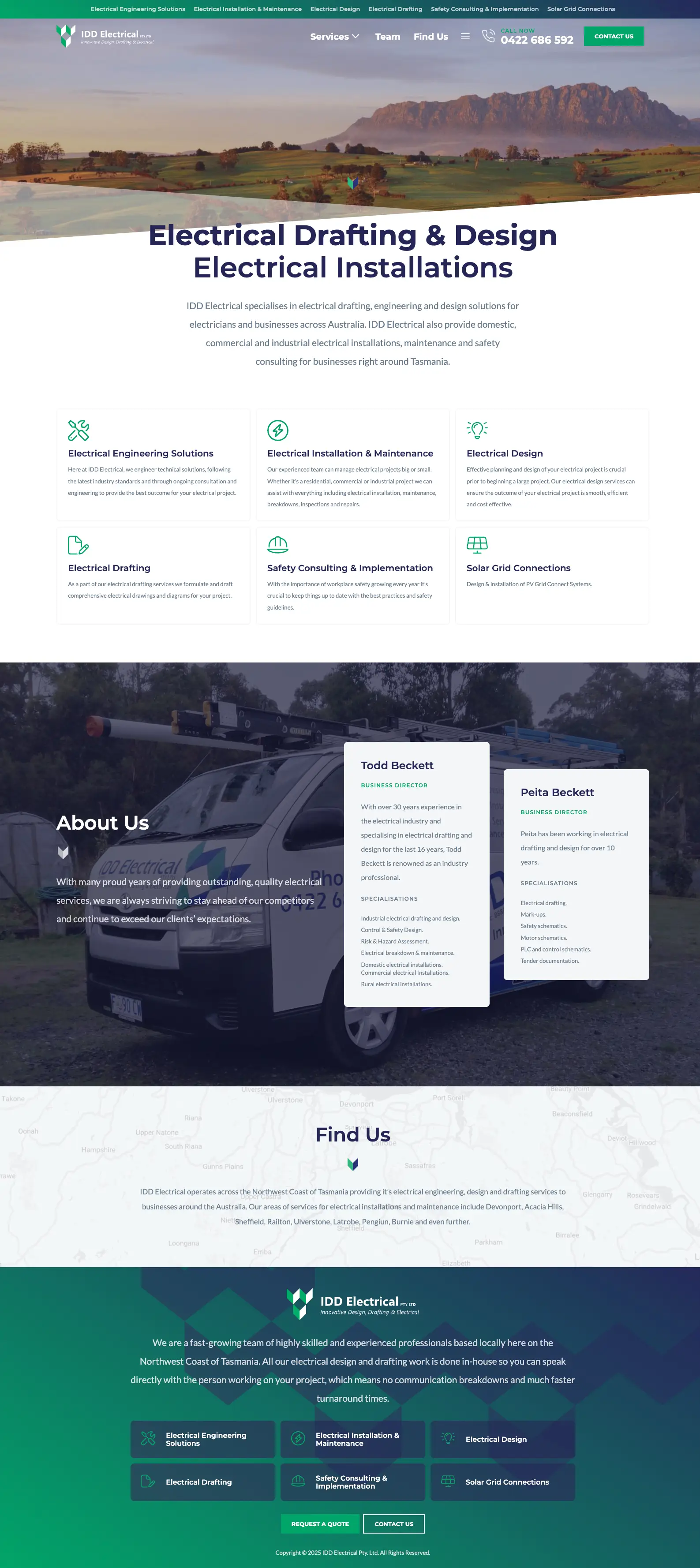
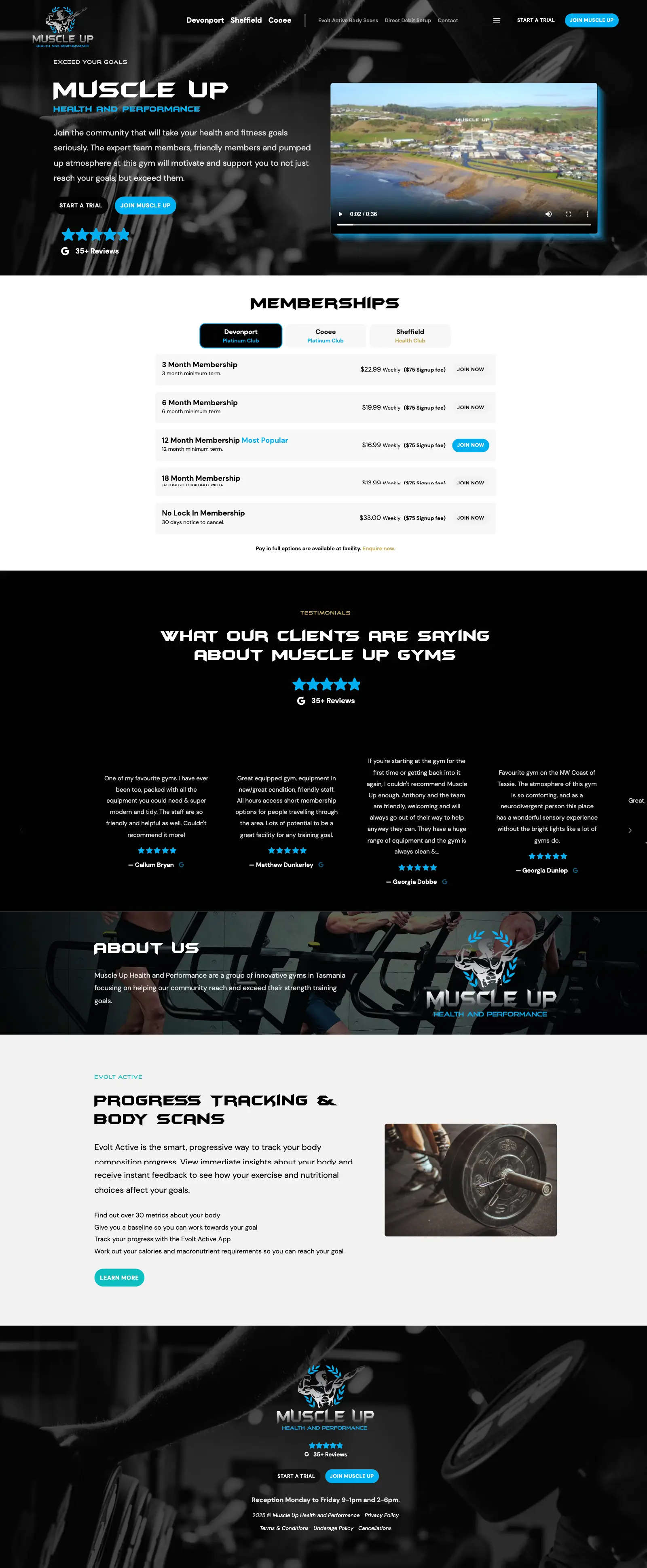
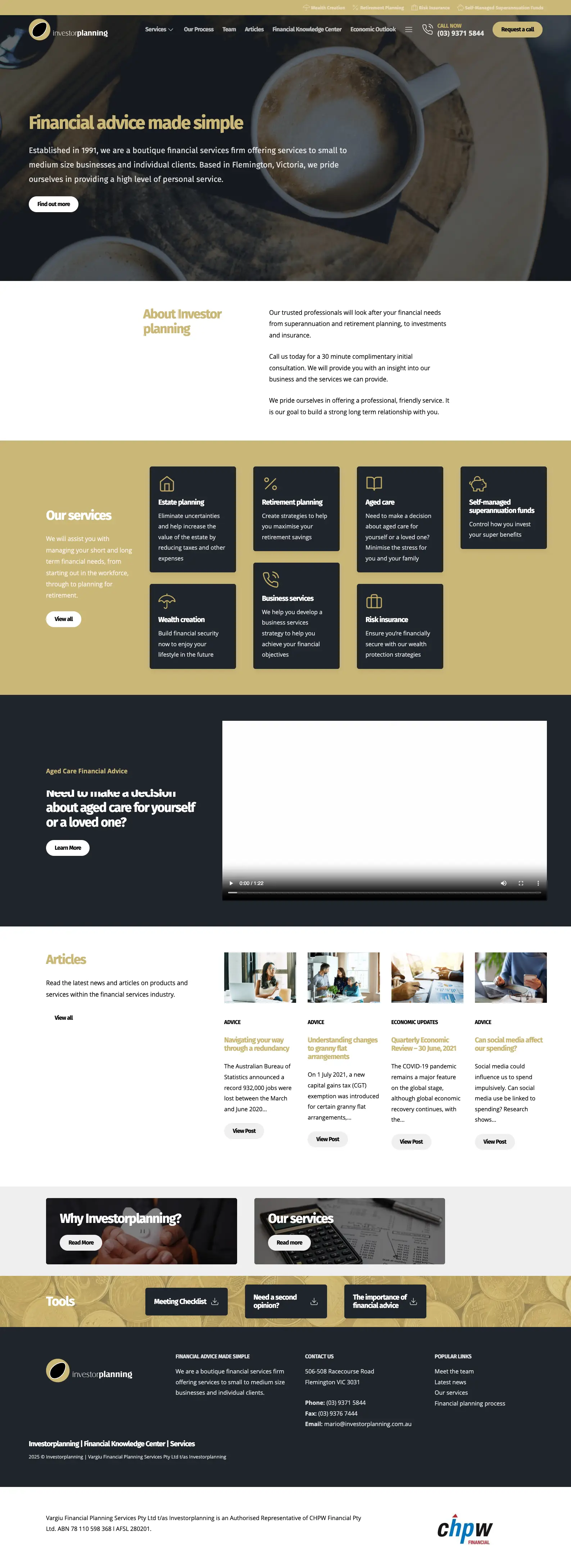
A taste of
our work.
Our web design process.
-
Reach out to book an initial web or phone chat with our team. We want to completely understand your web design needs. Together we will determine your project's requirements, scope, goals and design.
Following our discovery consultation, we will send you an outline of suitable packages we offer. Building a website is a highly creative process with limitless potential. Our packages allow you to choose the investment option that makes sense for you and your business, the more you invest the more we can engage in your project.
Once you've selected your package, we'll get you onboarded and schedule your project into our schedule.
-
Every big project starts with a discovery, planning and design stage. The package you choose will determine the scope of this discovery stage, with our bigger packages providing us with more time to dig deeper and be more creative.
This step is a little different from project to project, generally we start with learning about your industry, competitor research, understanding the unique value propositions of your business and bring this altogether into a plan for the website.
Generally we'll provide an sitemap, wireframe of the website with draft content and a design board to provide design direction. Depending on the package you choose and the scope of your project we may turn your wire frames into detailed pages designs.
-
Feedback and refinement is the backbone of a great outcome. We'll rely heavily on your inputs to guide the project. With your feedback we'l reiterate on the wire frames, mockups and content.
-
Once we have a solid direction for the website nailed down we'll begin to build the website.
-
Once your website is live, we'll be here to support it with one of our ongoing management plans. This is a comprehensive service, from our perspective it's the only way it should be. We'll cover everything to keep your site running smoothly. Your website will be hosted on one of our high speed and reliable servers. Included is software updates, security monitoring, backups, ongoing technical support, increased availability for requests, plus much, much more...
Some brands we've worked with.


Why choose us as your web design agency?
Imagine having a team behind you that has real solutions to the challenges you don't even know you have yet. We are that team. We bring real solutions to the table, grounded in reality.
Working with us FAQ.
-
Like with most things, it depends. A short website build can be between 1 and 2 months. An in depth build can go for as long as 12 months.
-
Not exactly, instead all of our website design packages spread the cost of your website over 12 monthly payments.
-
If WordPress is the right tool for the job, yes. However more often than not we find are finding WordPress and other powerful CMS systems are simply not required, and can even hinder a projects. We look to apply the best solution (from our experience and skill set) to each situation, and we are finding we are turning to simpler tools more often to create more reliable, performant and sustainable websites.
-
Absolutely, but rarely in finally products or outcomes. Ai is great for generating ideas, challenging our own thoughts and seeing alternative paths forward but the details matter in great outcomes. Ai is just another tool in our toolbox.
-
Once you're engaged with us, you'll have direct access to our email, where you can reach out anytime to ask questions, make requests, or schedule a meeting. You'll also be able to book time with us directly through our calendar.
Our priority is always our clients and their projects. To maintain focus and work efficiently, we don't take unscheduled phone calls, instead, we rely on email and pre-booked appointments. We understand this approach may not suit everyone, but it's been a pivotal and positive shift for our business, allowing us to provide more thoughtful, timely, and effective support.


